STUDIO·JULY 25, 2026
Custom backgrounds that make demo videos look intentional
Soft gradients, brand looks, and framed product UI, how backgrounds lift a screen recording without hiding the feature.
Screen Beaver Team·8 min read
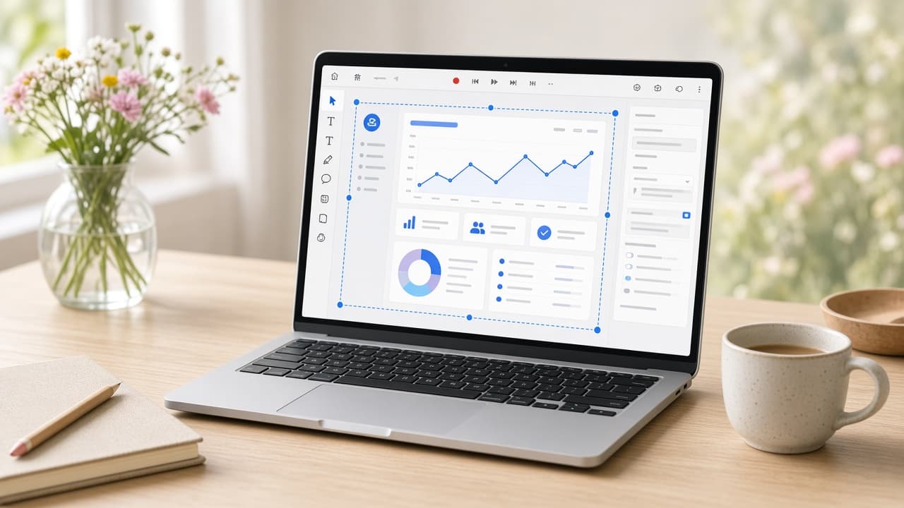
A custom background is one of the quickest ways to separate a planned product demo from a meeting recording. It gives the captured window a frame, hides irrelevant desktop edges, and creates room for captions or a short headline. It can also become a loud gradient competing with the interface for attention; we've made that mistake and spent the whole review looking at the canvas instead of the product. The background's job is supporting cast: establish a visual world, make the product easy to read, and stay consistent across the launch without demanding applause.
Begin with the product's hardest screen
Don't choose a background while previewing a blank white settings page. Test it behind the busiest dashboard, darkest modal, and smallest text in the recording. A pale app can disappear against a pale canvas unless the window has a shadow or border. A dark app may look heavy on pure black. Screen Beaver lets the captured product sit inside a designed frame, so use enough separation to preserve its silhouette without adding a glowing outline that looks dated six months later.
Subtle gradients are forgiving because they add depth without introducing objects the viewer might mistake for interface elements. Two nearby brand colors often work better than the brightest endpoints in the palette. Solid colors can look sharper for documentation and training. Photographs are risky: texture, faces, and high-contrast edges pull attention away from the actual feature. If the launch identity requires an image, blur or darken it enough that the product window remains the obvious focal point.
Give the capture room to breathe
Padding changes the character of a demo. A small margin makes the UI feel large and instructional; generous space feels more like a campaign film and leaves room for copy. Neither is universally better. For a dense analytics tool, preserve enough capture size that axis labels remain readable after export. For a simple mobile flow, extra negative space can balance the narrow phone frame. Check the final destination size before falling in love with a composition that only works in a large studio preview.
- Use one background family across launch, sales, and help-center variants.
- Keep the product window large enough for real UI text to survive compression.
- Add separation with restrained shadow, border, or contrast—not all three at full strength.
- Reserve clear areas for captions and logos instead of laying them over busy controls.
Design around motion and captions
Auto zoom changes how much of the background appears from moment to moment. Review every punch-in to make sure the frame doesn't feel as if it's sliding off the canvas. Pointer highlights need contrast outside and inside the product window, particularly when the cursor crosses the edge. Captions should have a stable, contrast-safe home. A translucent caption plate can help, but if every scene requires a heavy box, the underlying background is probably doing too much.
Aspect ratios deserve separate decisions. A 16:9 background can place the product centrally for a launch page, while a 9:16 social cut may need the window higher to leave space for platform controls and burned-in captions. Cropping the widescreen composition automatically often produces tiny UI surrounded by beautiful but useless color. Keep the visual ingredients consistent, then recompose for each ratio. Screen Beaver's timeline and framing tools make that less painful than rebuilding the look in a general motion graphics project.
Animation in the background should be even quieter than color. A slow gradient shift can stop a static setup scene from feeling dead, but moving particles, looping waves, and decorative blobs consume compression bandwidth and pull the eye from small interface changes. They can also make local H.264 files larger without improving the explanation. If you use motion, preview the busiest auto zoom and the longest caption over it, then watch at half attention like a real feed viewer. If the canvas is the first thing you remember, freeze it. A still background with purposeful product motion almost always ages better.
Create a repeatable mini-system
Save a small set of approved choices: the background colors, window radius, shadow, padding, caption position, and logo treatment. Give each preset a plain name such as “Docs Light 16:9” or “Launch Vertical,” not “Gradient Final Final.” This turns the next demo into a content task instead of another design review. It also helps multiple teammates produce clips that belong together, even when one records a Windows app and another captures Android over USB.
Finally, watch the locally exported H.264 on the page or feed where it will live. Compression can create banding in smooth gradients, shadows may disappear against a dark site, and a framed window may be too small on a phone. Adjust the actual problem rather than piling on effects. A good custom background makes the product look intentionally presented, but it doesn't hide weak pacing or unreadable UI. Get the story and capture right first; then give them a frame that feels unmistakably yours.